• Home
  • Services
    • Web Design Updates
    • Website Development
    • eCommerce Web Design
    • Multimedia Website Design
    • Responsive Website Design
    • Search Engine Optimization
    • Website Maintenance Services
    • Social Networking
  • WebLog
    • Development
    • Search Engine Optimization
    • Coding
    • Operating Systems
    • Media
    • News
  • Webmaster Tools
    • CSS Button Generator
    • RGB and HEX Color Charts
    • Meta Tag Generator
    • Password Encryption Utility
    • Robots.txt Generator
  • cPanel
    • cPanel Interface
    • cPanel Homepage
    • Add Domain Names
    • Email Accounts and Settings
    • cPanel File Manager
    • cPanel Databases
    • cPanel Stats and Metrics
  • Web Hosting
    • Basic Web Hosting
    • Standard Web Hosting
    • Premium Web Hosting
    • White Label Hosting
  • Computer Repair
Web Hosting Login
Login

Login
Central Montana Web Design - ReddWebDev
  • Home
  • Services
    • Web Design Updates
    • Website Development
    • eCommerce Web Design
    • Multimedia Website Design
    • Responsive Website Design
    • Search Engine Optimization
    • Website Maintenance Services
    • Social Networking
  • WebLog
    • Development
    • Search Engine Optimization
    • Coding
    • Operating Systems
    • Media
    • News
  • Webmaster Tools
    • CSS Button Generator
    • RGB and HEX Color Charts
    • Meta Tag Generator
    • Password Encryption Utility
    • Robots.txt Generator
  • cPanel
    • cPanel Interface
    • cPanel Homepage
    • Add Domain Names
    • Email Accounts and Settings
    • cPanel File Manager
    • cPanel Databases
    • cPanel Stats and Metrics
  • Web Hosting
    • Basic Web Hosting
    • Standard Web Hosting
    • Premium Web Hosting
    • White Label Hosting
  • Computer Repair

Adapt your content from 4-Inch to 40-Inch

Most modern displays, regardless of size, use a 16:9 aspect ratio:

Home CodingAdapt your content from 4-Inch to 40-Inch
Adapt your content from 4-Inch to 40-Inch

Adapt your content from 4-Inch to 40-Inch

August 12, 2015 Posted by Alan Coding

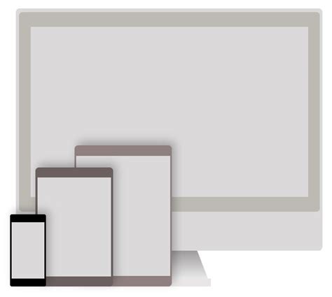
Adapt your content from 4-Inch to 40-Inch — When adapting content from a 4-inch to a 40-inch display, several considerations must be made to ensure the content is optimized for the larger format:

Resolution and Pixel Density:

4-inch displays: Often have resolutions between 800×480 to 1920×1080 pixels, depending on the device. At this size, pixel density is crucial for clarity.
40-inch displays: Typically feature 4K resolution (3840×2160 pixels). The increased size means that pixel density becomes less critical for general viewing but still important for detailed graphics or text.

Adaptation:

Ensure your content scales well to 4K. Text and images should be crisp at this resolution. If your source material isn’t 4K, consider upscaling or redesigning with higher resolution assets in mind.

Aspect Ratio:

Most modern displays, regardless of size, use a 16:9 aspect ratio, but this can vary in older or specialized devices.

Adaptation:

Verify that your content fits the 16:9 aspect ratio common in 40-inch TVs. Avoid black bars or stretching by designing or adjusting content to match this ratio.

Viewing Distance and Content Size:

4-inch: Designed for close viewing where every pixel counts.
40-inch: The recommended viewing distance is about 5 to 7 feet, which changes how content is perceived.

Adaptation:

Text and UI Elements: Increase font sizes and UI element dimensions to be legible from a distance.
Visuals: Make sure images or video content have enough detail to look good when scaled up.
User Interface: Simplify the layout or use larger icons and buttons for ease of navigation from afar.

Content Layout:

On a smaller screen, vertical space is often more limited.
A larger screen provides more real estate for horizontal content and detailed information.

Adaptation:

Redesign layouts to take advantage of the wider screen. Spread out elements if appropriate, but maintain balance to avoid overwhelming the viewer.
Consider split-screen or multi-zone content for different information types or interactive elements.

Color and Contrast:

Larger screens often benefit from more contrast to keep content vibrant at a distance.

Adaptation:

Adjust color schemes for better visibility. Brighter, more saturated colors might work better for large screens, especially in well-lit environments.

Interactivity:

Small screens require simple, large touch targets, while larger screens allow for more complex interactions.

Adaptation:

If the content includes interactive elements:

Ensure buttons and interactive zones are adequately sized for precise selection.
Consider different input methods like remote controls or gesture controls for TV-sized displays.

Accessibility:

With a larger screen, consider accessibility features like high-contrast modes or larger text options that can be more easily adjusted.

Testing:

Always test your content on the actual hardware or emulate the conditions as closely as possible. What looks good on a small screen might not hold up on a larger one.

When you adapt your content from a 4-inch to a 40-inch screen, it’s not just scaling up visual elements but fundamentally rethinking how information is presented and interacted with, considering the different viewing environments and user expectations.


Tags: 4-inch phone40-Inch TVscomputer deskinternetResponsive Web Design
Share
1

About Alan

Changing the world, one lonely line of code at a time -- Specializing in projects that combine beautiful interactive design with intelligent technology.

You also might be interested in

The Spawning of the Adblocker

The Spawning of the Adblocker

Sep 13, 2015

The spawning of the Adblocker — We can lead a[...]

Website expectations: What would you want exactly?

Website expectations: What would you want exactly?

Aug 3, 2012

Website expectations: What would you want exactly? I like media[...]

Internet web hosting – then and now

Internet web hosting – then and now

Sep 17, 2015

Here’s a bit of a look at internet web hosting[...]

Leave a Reply

Your email is safe with us.
Cancel Reply

You must be logged in to post a comment.


video
play-sharp-fill
Link

New England Journal of Medicine

Categories

  • Coding
  • Development
  • Media
  • News
  • Operating Systems
  • Search Engine Optimization

Contact Us

We're not around right now. But you can send us an email and we'll get back to you, asap.

Send Message
Experience the freedom of the Internet with your own Website Solution. Get Your Free Quote!


- internet web hosting
- linux server
- domain names
- dedicated ip's
- shared web hosting
- dedicated web hosting

Website Development

- forms and email
- jQuery sliders
- photo galleries
- image graphics rendering
- sitemaps xml
- social network integration
- website maintenance

Website Design

- website design
- website redesign
- website development
- ecommerce websites
- content management systems
- website rescue
- small business web design

Contacts

Great Falls, MT 59404
Phone: 406-788-4084
Friday - Sunday
8 AM – 8 PM MST

2025 © ReddWebDev.com

  • Contact
  • About
  • Acceptable Use Policy
  • Privacy
  • Linux for PC’s
Prev Next